Behind The Scenes 1
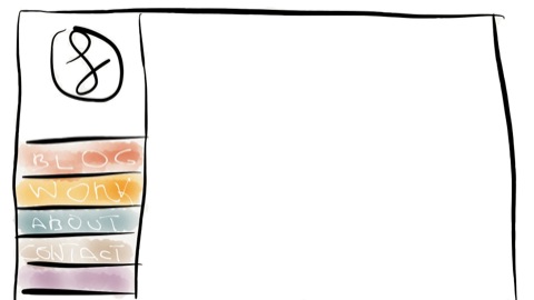
This site is a huge leap forward for me and my presence on the web. The idea of making a personal website is years old, I’ve always tried to come up with something. None of the solutions where good enough; After a period of time (usually hours) what I thought was awesome, made my eyes bleed. But, the more rejected ideas, the more it was clear what I really wanted to achieve. I’ve started thinking a lot more about my image, choosing colors, defining a logo, favourite fonts, layouts, and off course technologies.
TL;DR
For those who don’t have time, concepts and technologies in this part:
- Content Out
- Mobile First
- Responsive Design
- Icon Fonts
- PictureFill
Content Out
After the unsuccessful attempts it was clear something was wrong. Everytime something started, a point of no return was hit. Your immagination and sketches only provided the right solution for a part of the problem, but, when applied to the remaining parts, the limitations became clear. After reading The elements of content strategy by Erin Kissane, a solution rised. Stop being so impulsive, and first think about the message you want to convey, and how to organize it. Graphics comes second.
Mobile First
With web traffic on mobile devices on a constant rise, having your site not optimized for a mobile experience is pure madness. After delineating the content structure and having some filler text in place, it was time to make it look good on a small screen. My assumptions were the following.
- Make navigation links big enough to be touchable
- Text should be readable
- Provide quick contact info
- Reduce markup and css to a bare minimum
Most points are straightforward, get a real mobile device (not a simulator) and start adjusting things around.
Apple provides some good UI guidelines and states that touch areas should be at least 44x44 pixels wide. That’s enough for your finger to touch something easily.
Once you are done with the navigation start looking at the text from different distances, does it look good? Is the margin enough? What about line-height? Landscape works too?
Repeat until the result satisfies you.
By having just the most important informations on screen, your markup is automatically reduced to a minimum. Focus just on semantics, the rest will come by itself. Don’t overcomplicate css.
If your visitors are using a mobile device you can assume, with some approximation, they want to get info about you and how to get in touch. Provide some links to your email, twitter, whatewer on the homepage.
Responsive Design
Responsive Design might sound easy, but it isn’t. If you think it’s just about making a site adapt to different device sizes, you are wrong. Responsiveness isn’t just about sizing up and down, it’s also about perceived snappyness. Do your visitors really need to download a huge image even on a smartphone? I think not.
Optimize your Images
For image optimizing this website I’ve choosen the awesome PictureFill. It’s a Polyfill, so standards following people beware! This small piece of script allows you to apply media queries to images, that’s awesome! While the W3C and the WHATWG decide a standard for responsive images, this is a must have. It might require more work on your side by resizing all the images but the results are well worth!
Icons
Icons play a key role of this design, they should scale from an iPhone sized device to a full featured 27” screen. They should also scale at different pixel densities. The solution? Icon Fonts!
What does scale better than a font? I’ve decided to use Drew Wilson’s awesome Pictos Server. It saved me from madness and the result is simply great!
In the upcoming parts I’ll talk more about the coding tools I’ve used.
Hope you enjoyed.
Luca